BRUNET
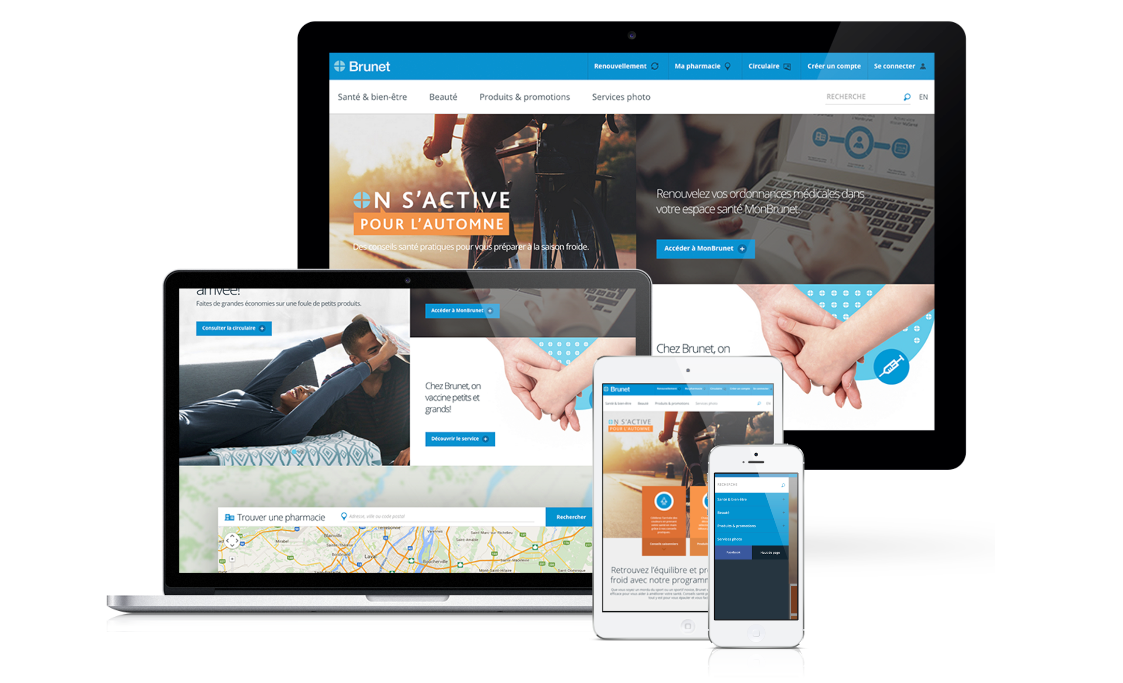
Health tips, tools and information available to customers, no matter the place or time
From its founding, Brunet has pursued its development by seeking to continually improve its offer of high quality pharmaceutical services. The company employs more than 3,000 people in Quebec and operates a network of close to 200 pharmaceutical establishments under the banners: Brunet, Brunet Plus, Brunet Clinique and Clini Plus.
PROJECT OVERVIEW
Brunet wanted to reposition its digital offering to better support business objectives and display a strong position among the best pharmacies in Quebec. The Brunet.ca site was therefore identified as the starting point of this digital evolution to help the company be recognized as a health expert and advisor.
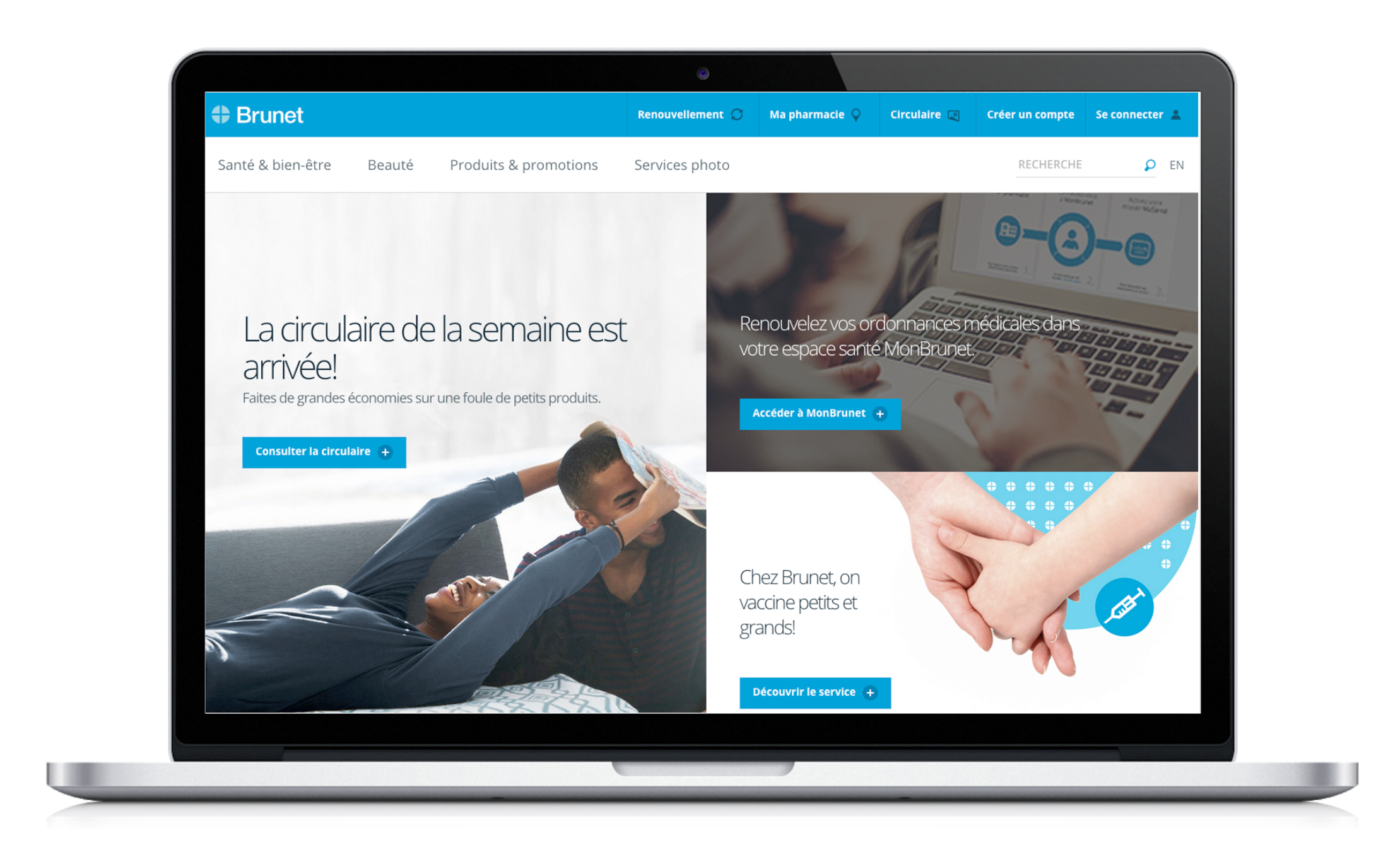
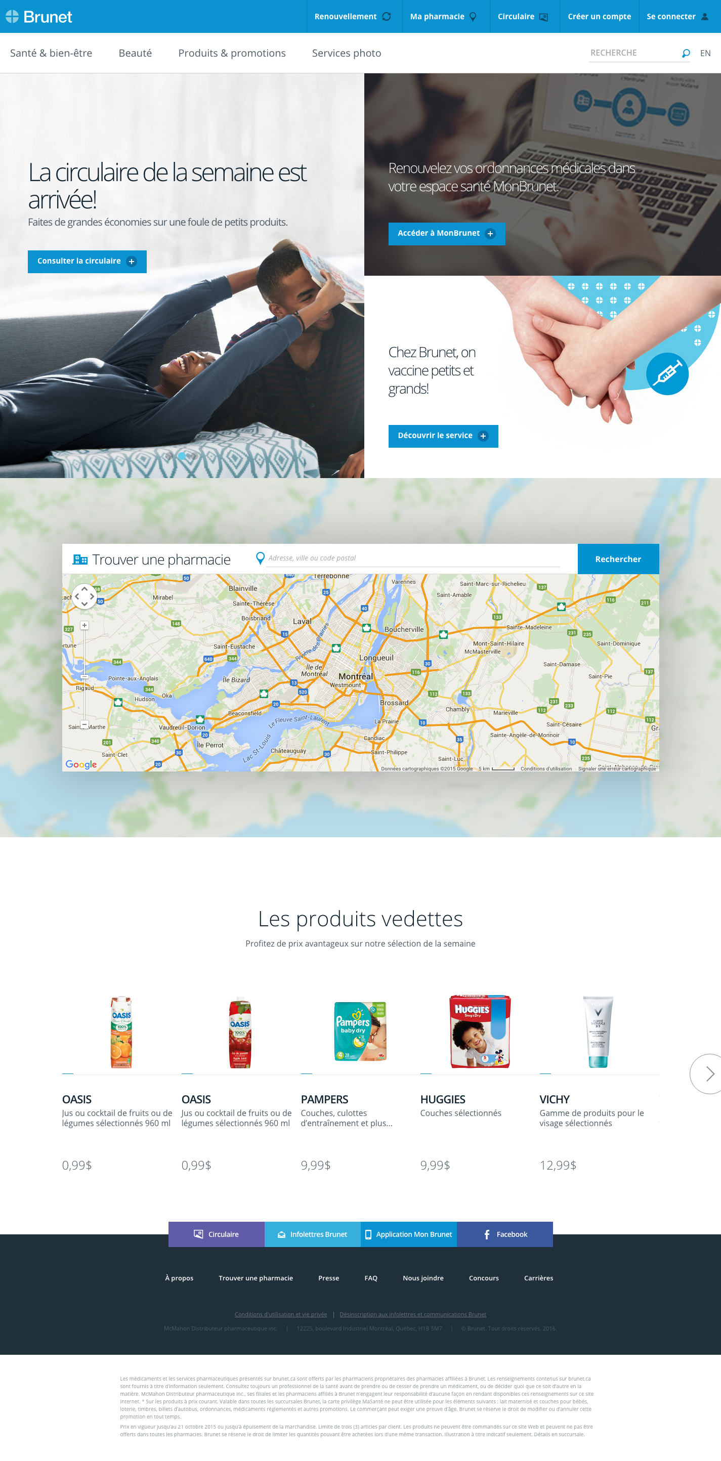
A complete redesign of the site allows Brunet to establish a modern brand image while developing a comprehensive and scalable content strategy to better meet the search habits of Internet users. With its adoption of responsive web design, Brunet shows it is a brand very close to its customers, no matter the place or time.
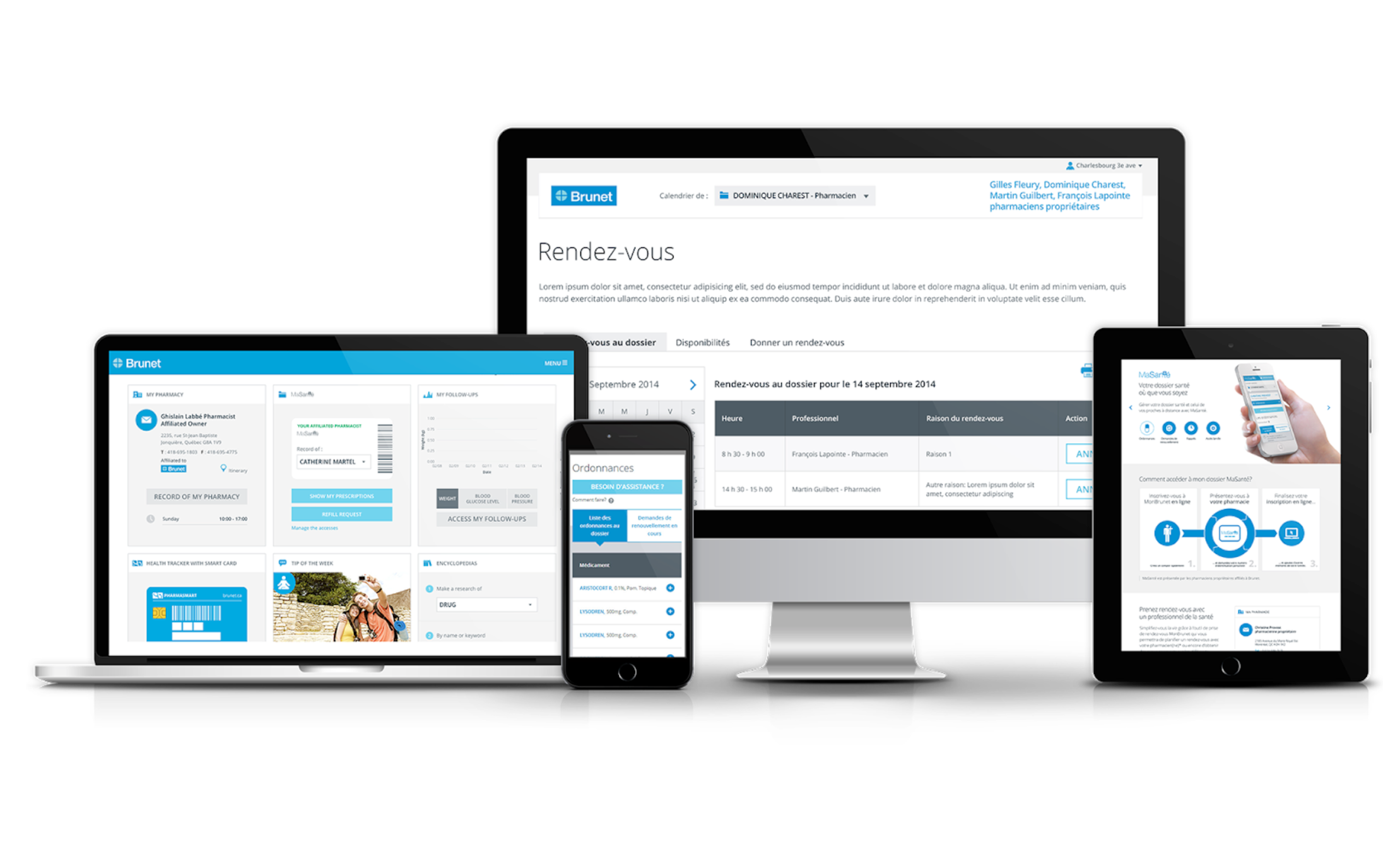
Brunet also wished to enrich its pharmaceutical services (My Health) through a personalized health portal.
ECOSYSTEM & MARKET
MY ROLE
In a collaboration with marketing and SEO specialists, I contributed to the identification of the most searched topics in the health field and participated in the development of an effective content creation strategy. I subsequently grouped major themes and developed a site map positioning them optimally from a user perspective.
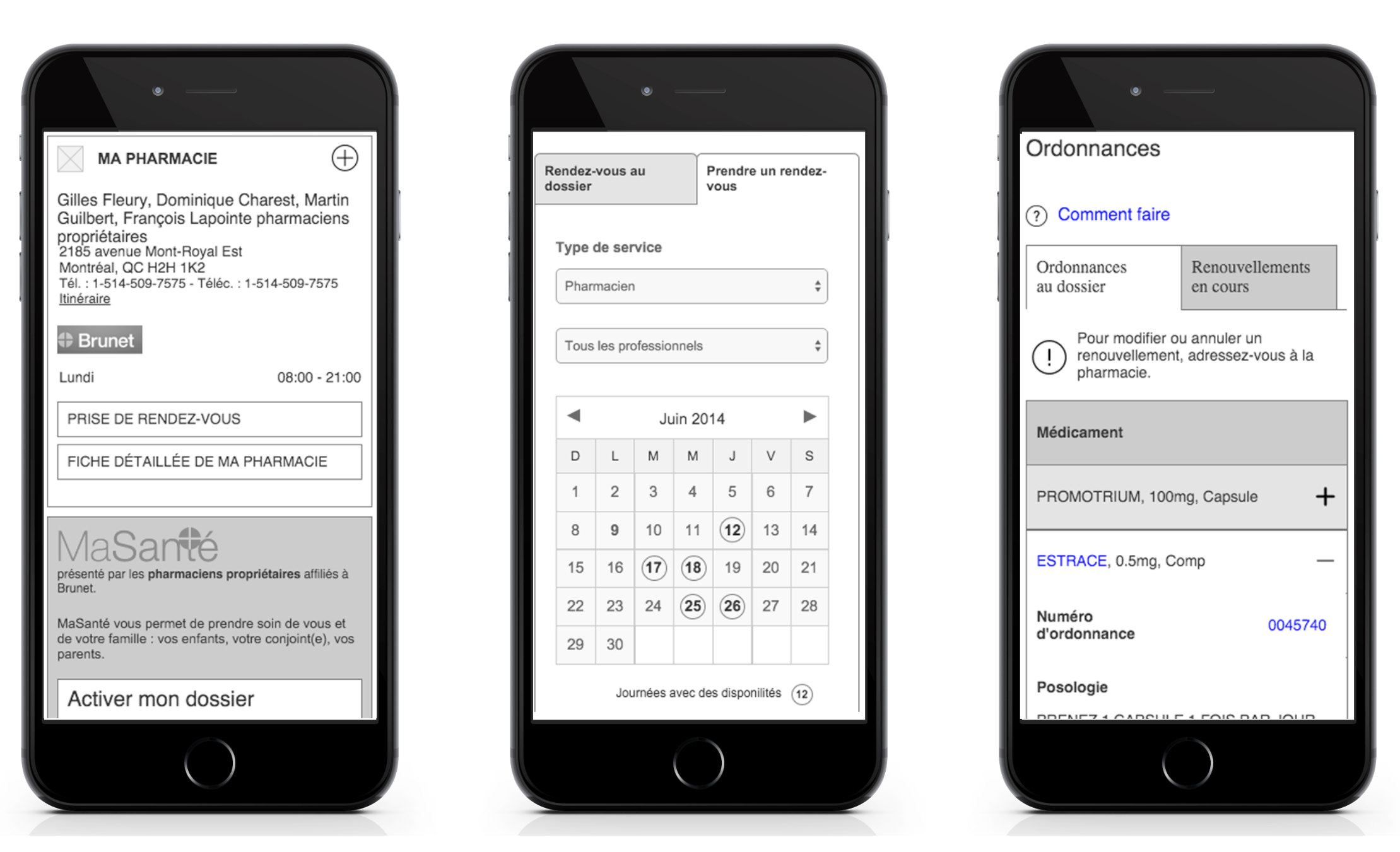
Since the site was in responsive design, I put in place a navigation that would be effective for all types of target devices (mobile, tablet and computer). I then designed the user experience models by integrating the different layout variations specific to each of them. I had to design wireframe models and ensure the implementation of ergonomics reflecting the different uses and realities of a multichannel experience, while ensuring user familiarity and continuity from one device to another.
THE APPROACH
By doing a competitive analysis as well as a heuristic evaluation of several health portals, we identified the industry’s best practices from a content and ergonomic perspective, special attention was also paid to what would be an optimal information architecture for the type of content and tools that would be available on the new website.
Although the positioning of the health content was always a priority, it was also imperative to present the interesting commercial offer of the Brunet pharmacies. The beauty products and services area was to hold an important place, it was also important to highlight some elements such as the branch locator, weekly flyer, contests, and events in order to better serve franchisees of the brand. Work was also undertaken to enhance the presence of some existing tools, including the MaSanté program which allows users to access a variety of information, their pharmaceutical history, tracking tools, reminders and prescription renewals.
RESULTS
The redesigned website offers a clean, concise, easy to read and improved user experience.
With more than 200 health tips available and structured by theme, the user can easily locate and access relevant content regardless of point of entry.
Through the new personalized health portal, users can manage prescription renewals for the whole family, make appointments with their pharmacist and use health monitoring tools, from anywhere, at anytime, on any type of device.
